Standard Black vs Rich Blacks
Creating Data
Different Blacks
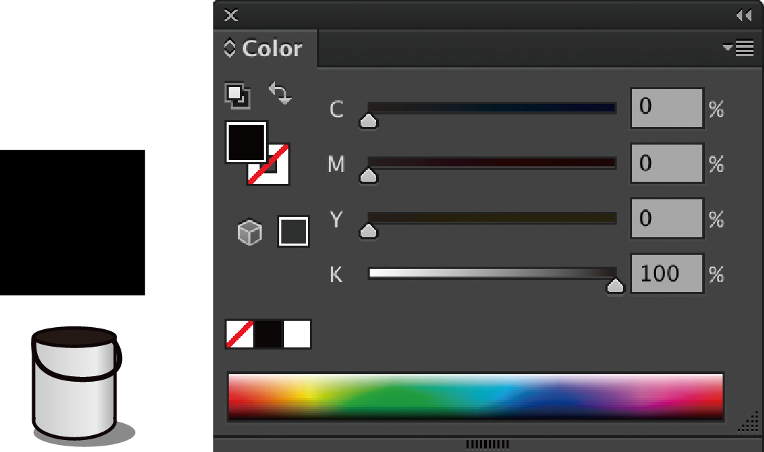
Did you know that there’s more than one way to create black? Standard black is printing 100% K ink, and is actually more like a deep charcoal grey. Using 100% K for body text or small solid objects will print out okay because the difference is too small for the eye to notice. However, when used on large solid areas it results in a flat muted black.
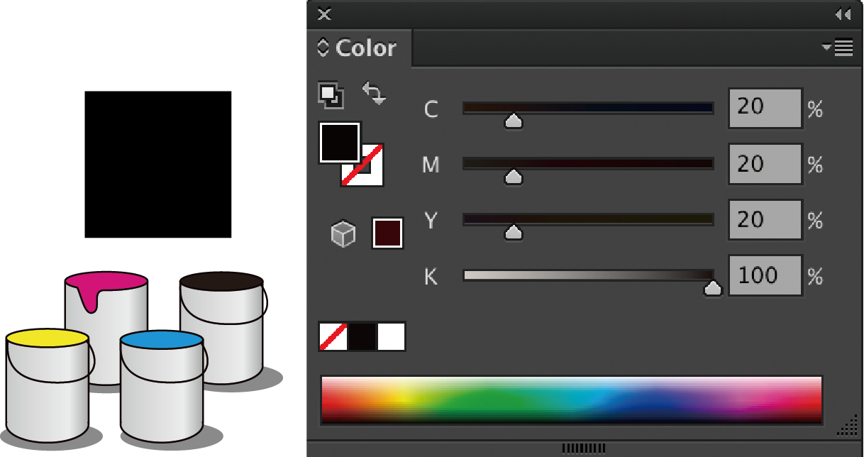
When creating your design you should keep in mind that there are two kinds of black: standard black and rich black. Standard black uses only black ink (100% K),while rich black is has cyan, magenta and yellow added to the mix. Rich black uses more ink to get a deeper, richer, beautiful black.
When to use black or rich black?
Knowing when to use standard black or rich black on your design comes in handy more often than you’d think. While there’s no rule set in stone, from our experience it’s best to use 100% black for all body/content text and small solid areas, and use a rich black anything you have large solid areas or large type. It may be difficult to tell the difference between the two blacks on your monitor, but on paper the difference will be quite noticeable (a flat black versus a deep rich black).
Standard Black (K100%)
Black ink is only used.
Best suited for:
- Small type, from 6pt ~ 36pt (depending on type face)
- Small black areas on white (or darker) backgrounds.
- Thin lines

Rich Black (C20% M20% Y20% K100%)
Results in a darker and deeper black.
Best suited for:
- Large type, say 40pt or larger
- Solid areas, anywhere you want a nice solid black colour.
- When using black over other colours (to prevent the
background colours from seeping through).

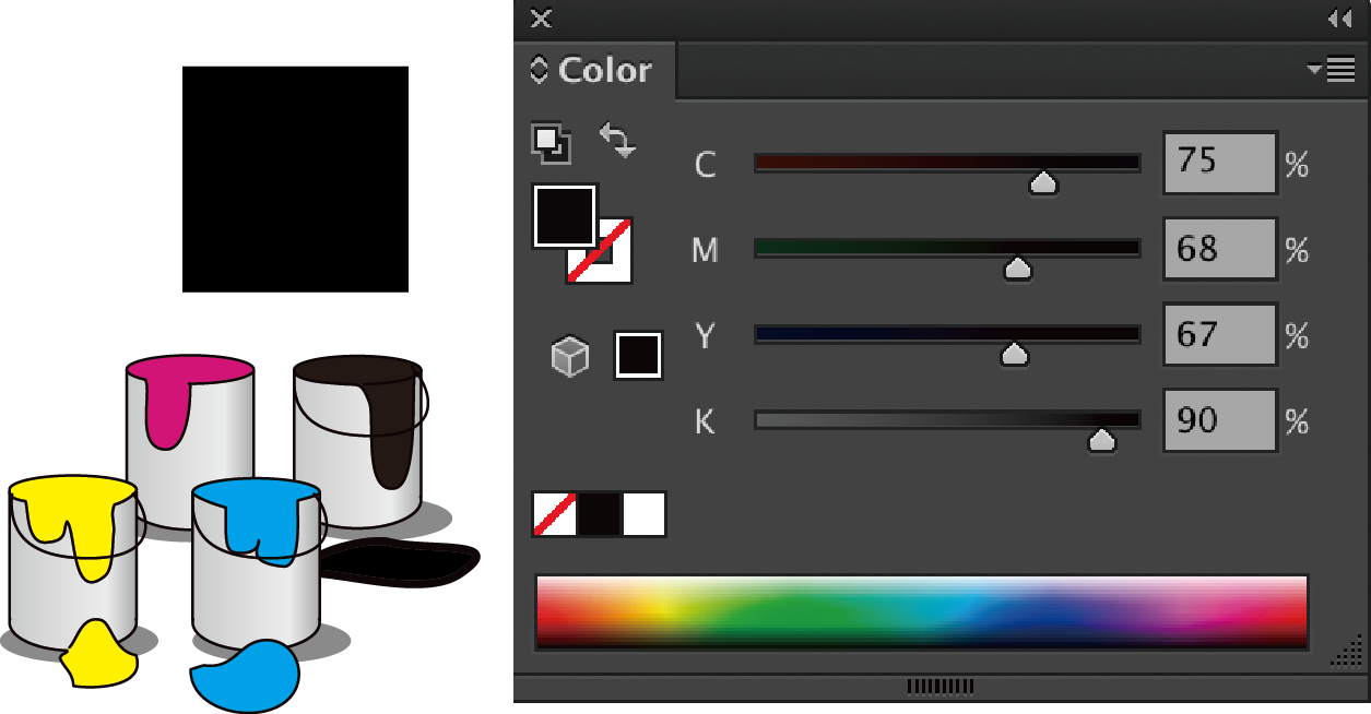
Total ink coverage of 250% and above is too saturated
CMYK values over 250% is not recommended, and will likely cause one of the following problems:
- Heavy ink usage may not dry correctly, causing ink to
rub from one sheet to the next. - Text may come out blurry (if registration plates are
slightly misaligned). For best results, body text should
be limited to as few colours as possible (80%-100%
black works best).

Please note: Colours used in Photoshop do not always transfer to the same colour values in Illustrator. For example: Standard blacks used in Photoshop will become a different shade of black in Illustrator.
Whenever possible you should use 100% K black for standard text / copy in your design. From business cards to A4 flyers, 100% black text over white or coloured backgrounds is strongly recommended. Rich black for text is recommended only if your text is very large (if you are designing for a poster or if your text exceeds 36pt in size. Refer to the below examples:
Standard Black

Recommended!
Standard Black (C:0% M:0% Y:0% K:100%) text
100%K is deal for body text and thin lines.

Recommended!
Using white text over 100% solid objects.
Rich Black

Rich Black (C:20% M:20% Y:20% K:100%) text
Using rich black for body text or thin lines may become difficult to read if any misalignment occurs.

Using white text over rich black object may be hard to read if the plates misalign.
How to prevent see-through blacks?
Objects that are set to 100% black will overprint by default. Overprinting is when a colour prints over another colour, showing through the colour underneath.
For example (see below),you have a colourful background and want a black eagle to appear on top. If you use a regular black (100% K),when the solid black is printed on top of the various colours, the underlying colours or image will show through. By using a rich black you prevent the problem.

Standard Black (K)
K100%

Rich Black (CMYK)
C20%, M20%, Y20%, K100%


 info@metroprint.ph
 0945 826 3908
 0945 826 3908